The One District One Product (ODOP) initiative is designed to promote balanced regional development across all districts of the country. Its goal is to select, brand, and promote at least one product from each district, emphasizing the unique offerings of each region.
I designed a logo for the ODOP initiative in Jammu and Kashmir, aiming to showcase the region's cultural heritage by incorporating all of its unique products.This logo is for the logo competition of the Jammu and Kashmir ODOP (One District One Product) initiative, organized by the Jammu and Kashmir Trade Promotion Organization (JKTPO) in collaboration with MyGov.

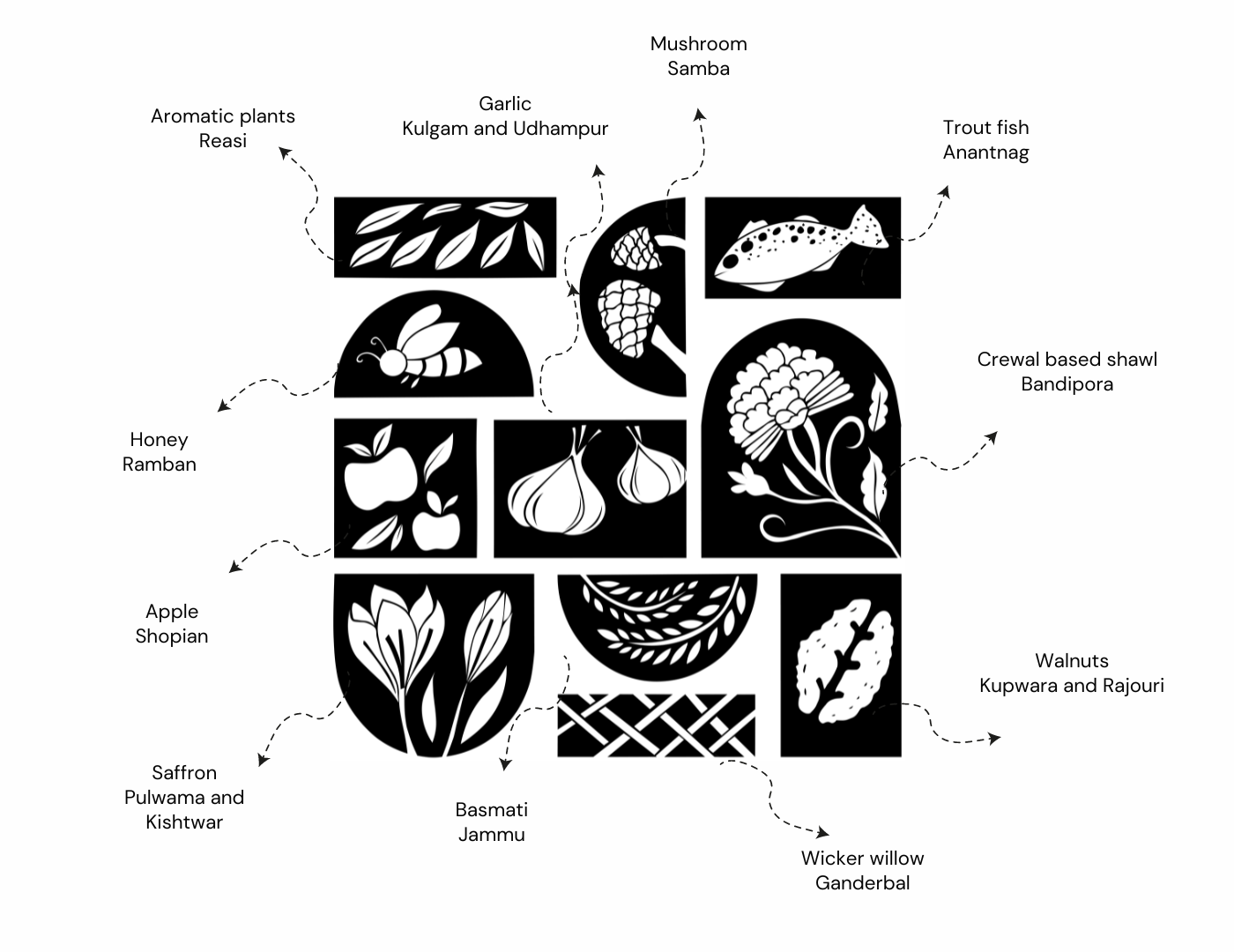
Behold, a mesmerizing logo concept that beautifully encapsulates the vibrant geographical and cultural tapestry of Jammu and Kashmir. This design is laser-focused on celebrating the distinct allure of the Agri-Horti and Handicraft & Handloom sectors as part of the OPOP initiative. It serves as a beacon, radiating growth, culture, and the extraordinary individuality of each district, all while showcasing the awe-inspiring landscapes that define this enchanting region.Within this logo, you'll find a rich tapestry of colors borrowed from the very heart of Jammu and Kashmir, each shade echoing the essence of the land.

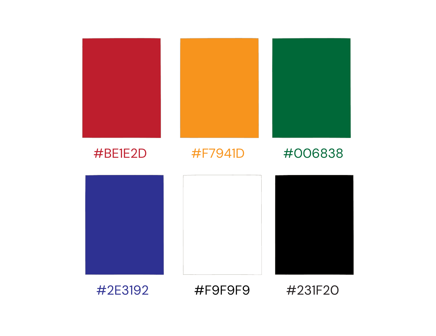
The colors red, yellow, green, white, black, and blue in this ODOP logo likely symbolize various aspects of Jammu and Kashmir's culture and the initiative's goals. Red represents vibrancy, yellow signifies positivity, and green symbolizes growth and harmony with nature. White represents purity, black symbolizes sophistication, and blue conveys trust. Together, these colors reflect the initiative's commitment to promoting the region's unique products and cultural heritage.